I understand that search bar position is not changeable by theming, it's a Thunderbird team's decision, but it irks me to see it take up so much premium space.
It was the same with browsers, it took many years and iterations to get where we are now (tabs on top, no wasted space) and I think those lessons should be carried over.
Tabs at the top is wasted space, I much prefer my tabs on the side instead, as most web content is taller than it is wide, and I have a widescreen monitor. I understand the choice of tabs on top when 640x480 was the most common resolution, but for desktop usage today? Tabs on top seems like an outdated layout choice.
I generally have the same hatred but oddly on Mac OS I prefer the Dock on the right side. I've been dual Win/Mac user and have had this preference on Mac for a long time. Not sure why as it goes against almost everything else I do LOL
I had my Mac dock on the side for a while, but I’m back to bottom dock as I work with two external monitors and just leave the dock on the laptop display. I also had the taskbar on the left of my Win2k setup for quite some time but these days I hardly use windows outside of gaming so it just stays where it is by default
Yeah this. What should irk about search bar is cannot be moved. The static nature of UI these days stinks when back in the day we aimed for more composable user facing apps. Mod games by dumping a model file in a dir; boomed recomposed the experience.
Now it’s all micro transactions so an MBA doesn’t have to work anymore.
Now those are power user and dev tools and users get what they decided was the just right info dense or sparse design.
I still fall a slight bit in love when an application has a “Customize…” option attached to the menu/ribbon/whatever. I had Word set up just the way I wanted it some 20 years ago
There are browser - Vivaldi for example - that allow you to place the tab strip on any edge you want. To me personally it just looks and feels wrong, maybe just because of years of exposure to tabs on the top, but I can not get used to it, even though I have to admit that the tab labels are much nicer to read on the left if you have sufficiently many tabs open.
Not only does Vivaldi allow you to do that, but you can customise every menu in the program. I've modified the context menu to have exactly the things I want, in the order I want them. This is what Firefox should have been.
It's too bad I'll have to dump Vivaldi soon, now that Google is killing adblockers.
I’ve been daily driving Arc for a while now and I’m very sold on the tabs on the left. I think it’s the mix of smart folders, pinned pages, and knowing that stale tabs will be automatically closed so it doesn’t ever feel too cluttered. Also the quick show/hide with Cmd+s is perfect, especially since it’s been quite a while since I’ve wanted to Save a webpage.
Side note: it infuriates me that Microsoft’s web-Office will “helpfully” remind me that it auto saves when I do Cmd+s but also captures the event so that Arc can’t handle it. Which reminds me…I can probably whip up a quick Boost to get rid of that - yay rubber ducking in the comments!
I've always been sad "tabs + browser bar + title bar" (i.e. in a single row) at the top never seems to stick around as an option. On larger monitors this results in a near perfect utilization of space while still being able to have reasonably wide tab titles.
Vivaldi & Floorp offer this through being highly customizable but they tend to have cracks around the edges of their use for the same reason.
I was first introduced to this with a Chrome flag back in 2011 https://www.askvg.com/how-to-enable-new-compact-navigation-f... but they ended up backing out for various reasons (the largest of which was probably the specific design used a pop-down url bar which went over the page area, so could be spoofed).
In 2021 Safari became the largest browser I've seen roll this out as a 1st party feature to general users, but it faced some backlash https://www.zdnet.com/article/how-to-get-more-space-in-safar... I'm not a big fan of their particular styling choices but the layout was pretty decent.
This is a popular argument, just one small problem with it: the 4:3 displays of old (640×480 et al) were also "wide" rather than "tall". So by this logic, there would have never been a time where horizontal tabs (or indeed, a horizontal taskbar) would have "made sense".
So I think it's reasonably easy to see that this is not and was never the actual driver behind this decision. It's completely retconned.
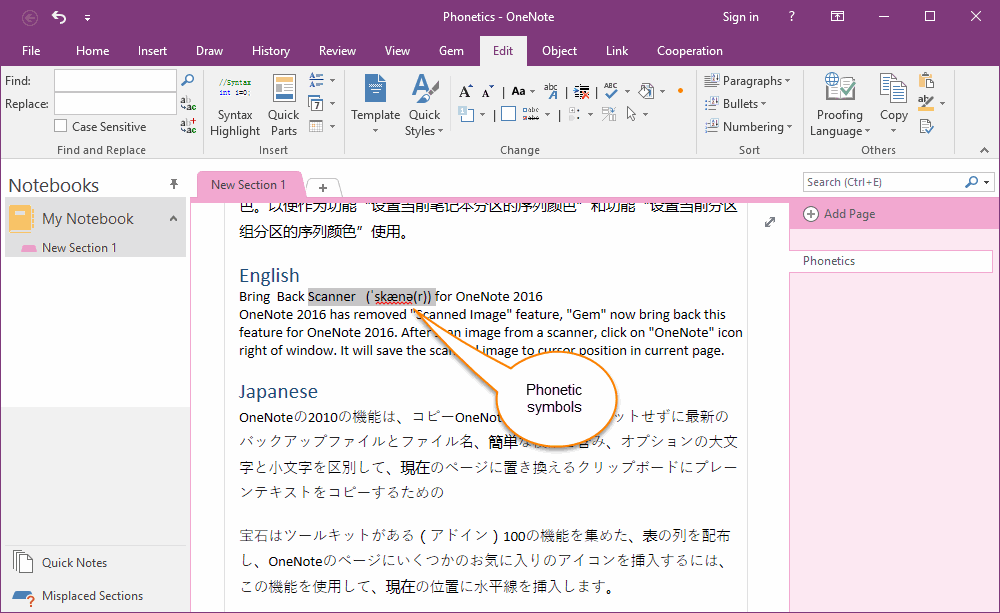
The driver was that unless you have a large number of tabs, vertical tabs waste more space than horizontal tabs, due to the width of the tabs column for vertical tabs vs. the height of the tabs row for horizontal tabs. Like in this [0] random example with just single tabs, there is a lot more wasted space on the left and right (below “My Notebook” and “Phonetics”) than on the top (to the right of “New Section 1”). If we used a vertical writing system instead of a horizontal one, we’d have had vertical tabs from the start.
Widescreen monitors afford that wasting of space better.
Well, 4:3 is less wide than 16:9 or 16:10 or whatever else we're doing these days.
But, I do agree that this was likely never the driver. In fact, I've always thought the "obvious" explanation is simply that window controls and title bars are at the top, and since tabs are like nested windows inside a window, they would follow basically the same patterns...
Horizontal space is still a premium regardless of monitor size when designing/building for responsive viewports. Vertical space is almost zero cost in terms of design constraints.
Even on large monitors you'd be surprised the number of people at 150% zoom with small windows opened instead of fullscreen.
Having a widescreen monitor is irrelevant to me unless I fullscreen my browser (which I don't and I assume most don't). My (multiple) browser windows on my very big wide screen are all roughly in 4:3 ~square shape and top tabs make a lot more sense.
And unless you have a browser full of tabs, vertical tab lists usually have massive amounts of purely wasted white space and are generally much less space efficient overall.
Every once in a while I wouldn't mind for a specific window to have vertical tabs with nested tabs, as a psuedo live-bookmark organization system for a current project. But it's not a daily driver for me.
> Having a widescreen monitor is irrelevant to me unless I fullscreen my browser (which I don't and I assume most don't).
Are you kidding? I'm willing to bet 99% of users run their browsers fullscreen.
Using the drag-and-drop feature that splits the screen between two GUIs already marks the office power user, a third windows on a single screen brings us into the territory of the hardcore nerds running tiling window managers.
> I'm willing to bet 99% of users run their browsers fullscreen.
99% of the folks I interact with usually just use whatever size the browser opens in initially, then maybe resize it if they're reading for a while, or need to see more info. If half a pic shows up, they might try to fumble to grab a handle to resize to see more of the pic; sometimes it works, sometimes they end up giving up.
Going 'full screen' may be different than just 'as wide and tall as the monitor', because 'full screen' mode gets rid of the window chrome, which causes confusion.
The only folks I know who consistently use browsers 'full screen' are on mobile devices where that's generally the only option.
Do you interact with a lot of people using macs? I find that Mac users don’t maximize their windows. They leave them cluttered everywhere; all the people I know on Windows maximize their windows.
Do you have a tiny monitor? I find that people with small mointors maximize their windows because they have to.
I have a 27" widescreen. The idea of maximizing a browser window is absurdity. My monitor can comfortably show three websites side by side. The amount of wasted white space on a full screen website would approach 90%.
Here's this very post fullscreened (without a taskbar). What a wild waste of space and the content is clearly not designed to be viewed like this, with the UX being located at the top left lol.
Because that is clearly not the norm for webpages? You're picking deliberate low-tech html pages. HN and memeorandum are not representative of the internet at large.
Honestly, man I don't care for this conversation. You do you bae. I was merely offering an observation of what I've seen from people and you're not even talking about that.
FWIW, I run my browser full screen. I run most apps full screen. By full screen, I don't mean that weird macos thing where it removes everything and locks you into a single app in a single workspace but the more standard one where the window is just expanded to fill the screen space.
The only time I run an app without fullscreen-ing it is if I don't have to do much in it or it doesn't have enough content to use up all the space anyways. Like system settings. Otherwise, I am using the app -> I am focusing on it -> I want it to take all the space it wants and show me everything going on inside it. My browser and my text editor are apps where I spend 99% of my time so they are always full screen.
It used to be possible to run web pages and applications not full screen. But moderne UIs are so wasteful of space, with massive icons, it has become almost impossible.
People don't maximize their windows? I have a 16:9 4k monitor and I maximize everything (browser, IDE, image editor, terminal, mail client) except for the rare occasion when I need something viewed side by side (editor+browser, terminal+browser, 2 file browsers, etc.).
Most websites handle it just fine, for the advanced interface of Mastodon the screen could be even wider! For the rare website that doesn't handle 16:9 well I have this bookmarklet:
One of my monitors is 9:16 - I've rotated it 90°. It's terrific for reading PDF documents, web pages, a terminal, and the IDE.
The only thing it's not really good for is the email client, video, and pictures. For those I have another monitor in the standard landscape configuration.
I used to have a similar setup, but I replaced the dual head setup (24" 9:16 and 30" 16:9) with one ultrawide one.
I suppose just as wide 16:9 display would have been even nicer, but it's fine. There are some benefits in window placement in having just a single screen, even if window managers could work better for this use (e.g. have a "second screen" region where there are separate workspaces).
I run everything maximized on my 32:9 and it's fine to me.
(I've never had overlapping windows in my life -- I find seeing more than one thing super distracting and it annoys me that this seems to be the default on Macs)
While the majority probably does, I don’t maximize anything that doesn’t have subpanels by default (like IDEs). In particular, I generally size application windows such that their main text content (if any) takes up a suitable middle column on the screen. That also means that I often have application windows with fixed-sized side panels not fill the whole width of the screen. My browser windows are by default something between 5:4 and 4:3-sized. Even with vertical tabs, the added width wouldn’t be enough to make them full-width.
> And unless you have a browser full of tabs, vertical tab lists usually have massive amounts of purely wasted white space and are generally much less space efficient overall.
The Firefox and Edge implementations have a collapsible panel for the vertical tabs. I agree if they didn't, it would be worse than horizontal tabs.
However, my pet peeve is that it's now impossible to disable tabs altogether, say when using a tiling WM that implements tabbing itself, controllable with the usual shortcuts. Firefox has an extension that always moves tabs to a separate window, but it's janky.
Putting often used controls (tabs, docs, menus, etc) across the long side has a solid argument going for it too, though: your mouse pointer is almost always closer to one of the long sides.
Also, if vertical screen estate is a concern, just turn your monitor 90°
A lot of professionals working with paper sized documents (legal, bookkeeping, administration) do this.
As a software engineer, I've tried it, but I prefer splitting windows (tiling, or panes or such) horizontally. So my estate is limited in width more than in height.
Tabs visible at all is wasted space. I only need to see the options when I'm actively trying to change tab. I don't need to see them on the screen at all times.
This is one of the things I love about my Emacs config. I just hit a key to get things like buffers or file trees up when I need them, then they disappear.
I'd love to have a keyboard driven browser but whenever I've tried I always end up with one hand on the mouse anyway so it doesn't work.
Have you tried vimium? It's amazing. You can press a single key to search tabs, a single key to search history, bookmarks, and many other functionalities. Not using a mouse is also pretty easy with the link navigation feature (f by default), but even with one hand the commands are so succinct that it works well.
But that wasn't the point of the person you are responding to anyway. The point is all the empty wasted space that was above the tabs before it was removed and the tabs moved to the top.
Not to mention that many Web sites are not optimized for modern screens, let alone truly large ones. There are still far too many absurdly narrow vertical text columns, riddled with tiny non-expandable images, on sites that appear to cater to 640 x 480 screens of yore.
The Thunderbird search bar really sucks. Advanced search with the actual functionality is hidden away behind some weird menu while the big honking bar at the top of each page does basic text search and offers nothing more.
> I understand that search bar position is not changeable by theming,
It is changeable. With enough dedication you can go a long way just with CSS.
In this case it is even rather easy because the "unified toolbar" the thing containing the search box, the menu bar (if shown) and the tab bar are three elements in the same flex box. They can be reordered by setting the order property.
Only downside in this case is that (if client side decoration is not disabled in the settings) the window buttons (close, minimize) are also part of the unified toolbar and would end (without further fixes) below the tab bar.
As a quick (and dirty) experiment I moved the tab bar left to the search bar in the same row just with:
And a hacky way which often works good enough is to reposition and hardcode stuff with position:absolute/fixed/sticky.
Finally Thunderbird's own customization dialog can be used to fill the empty space around the search bar. By default it has a spacer left and right but that is easy to change even without custom CSS.
That we can search at all is nearly a miracle given the old and bad infra.
At least they work hard (I hope) on replacing the old system with a real database. That should enable the conversation view (Gmail-like), too!
The current "conversation view" is misnomer. There really is nothing like that.
Again, just think of Gmail and how it's handled there. This is how it would look like, e.g. you actually see your own response, too.
Currently this is impossible because Thunderbird does not actually know what messages belong together. It just applies some ugly hacks to even find the ingoing emails. It's a trainwreck, but I believe it will get better and we will finally have some decent mail software out there.
I wouldn't describe it as a hack, it uses the references in the messages themselves, as long as they are accurate it will work perfectly. This is the same way, Thunderbird knows if you have replied/forwarded messages.
> you actually see your own response
I do see the response, why wouldn't I that's what the feature is for. Not sure if there is a bug for you.
It's not my words. There is a 1.5 hour long video of a maintainer chat uploaded to their YouTube channel a while ago. There one dev explains it very carefully and in depth – "ugly hack" is their words, not mine! Seems a lot of work to untangle that mess. They are already a long time over their estimates of how long it would take.
Not sure what you mean by that you see your own response. In the current "conversation" (thread) view the chain will only display incoming answers, but never your own outgoing emails – which well... would make it a true conversation view.
Fair enough, the implementation can be messy, which I know nothing about, while input and output data can still be clean and well defined.
It absolutely displays outgoing mails, that's what I was saying. It hasn't ocurred to me that it potentially couldn't, then it would be kind of worthless. Not sure why you have this bug, but that isn't normal, maybe you can report it?
Mh, yeah. You are right. It's flaky tho for me... Sometimes it displays my own messages, sometimes not. I won't open a bug for that right now. I just keep my fingers crossed we get the better implementation.
What is still missing now (even if or when it works), is a continous display for me. Currently you have to go email by email, which can be a bit cumbersome to navigate, because then you'll never get the "full picture" for a quick glance, if you get my drift.
Yes that might be useful. I do generally have the whole history in every message since it is added automatically, when replying so you can reply inline. Maybe some client don't do that though.